Africa, the world’s second-largest continent, has long been misrepresented on global maps.
Despite spanning more than 30 million square kilometres, large enough to fit the United States, China, India, and much of Europe combined, its true scale has been consistently shrunk by the Mercator projection, the centuries-old map that still dominates classrooms and digital platforms.
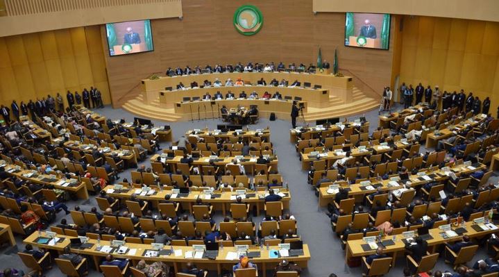
Now, the African Union (AU) is backing a global campaign to replace it with the Equal Earth projection, a map designed to show continents in their real proportions.
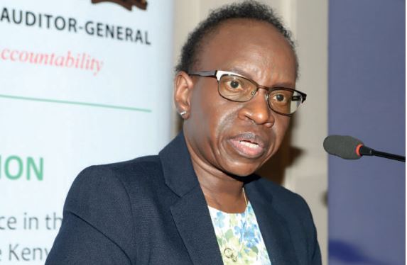
"It might seem to be just a map, but in reality,
it is not,” AU Commission Deputy Chairperson Selma Malika Haddadi said,
speaking to Reuters.
"The projection wrongly portrays Africa as
marginal". This is despite the fact that Africa is the second-largest
continent and home to more than a billion people.
What
is the Mercator map?
The Mercator projection was developed in 1569 by
Gerardus Mercator, a Flemish cartographer.
It was revolutionary at the time because it helped
sailors navigate oceans more easily.
On this map, any straight line follows a constant
compass direction, perfect for plotting courses across seas.
But there’s a cost: size distortion.
The farther from the equator you go, the more
landmasses are enlarged.
For instance, Greenland appears almost the same size
as Africa, even though Africa is about 14 times larger.
This distortion is not just a geographic quirk; it
carries historical and ideological weight.
Over time, the Mercator projection has been criticised
for reinforcing Eurocentric worldviews, visually shrinking Global South
countries while exaggerating Europe and North America.
The
campaign: Correct the map
Backed by the AU, the “Correct The Map” campaign, led
by advocacy groups Africa No Filter and Speak Up Africa, aims to end what it
calls a centuries-long misrepresentation.
Moky Makura, Executive Director of Africa No Filter,
calls the Mercator map “the world’s longest misinformation and disinformation
campaign.”
"It just simply has to stop," she said.
Her team, along with the AU, has submitted a formal
request to the United Nations Committee of Experts on Global Geospatial
Information Management (UN-GGIM) to adopt the Equal Earth map in official
contexts.
A UN spokesperson confirmed the request has been
received and will be reviewed through the standard expert committee process.
What
is the Equal Earth map?
Created in 2018 by cartographers Tom Patterson,
Bernhard Jenny and Bojan Šavrič, the Equal Earth projection was designed
specifically to preserve the proportional size of countries and continents, without
sacrificing visual clarity.
Unlike Mercator, it is an equal-area projection,
meaning that landmasses appear in true relative size; it avoids the visual
stretching and shrinking seen in other projections.
With the Equal Earth Map, Africa, South America, and
other equatorial regions finally get their rightful space.
It’s already being used by organisations like the
World Bank, which says it is phasing out the Mercator on its online maps in
favour of Equal Earth.
Why
this matters: Maps as ideology
For campaigners, this is not just a cartographic
correction. It is about identity, education and justice.
Fara Ndiaye, co-founder of Speak Up Africa, said, “We’re
actively working on promoting a curriculum where the Equal Earth projection
will be the main standard across all African classrooms.”
She described the Mercator map as a form of
“psychological and cultural violence,” subtly reinforcing ideas of inferiority
by making Africa look smaller and less significant on the world stage.
Even CARICOM, the Caribbean Community bloc, has
supported the shift, calling it a rejection of the "ideology of power and
dominance" baked into traditional maps.
According to Haddadi, the AU’s endorsement reflects a
broader vision:
"This is part of reclaiming Africa’s rightful
place on the global stage," she said, especially at a time when movements
for reparations, decolonisation and educational reform are gaining strength
worldwide.
Is
change already happening?
Yes, slowly.
In 2018, Google Maps replaced the Mercator projection
on desktop with a 3D globe view, though users can still toggle back to Mercator.
On mobile, however, Mercator remains the default.
While Mercator still dominates in classrooms and
digital maps, the rise of Equal Earth suggests that the conversation is
shifting, from navigation to representation.
The AU’s call is not about rejecting history. It is about
correcting it.
As more institutions, educators, and governments adopt
the Equal Earth projection, a new global narrative may emerge: one that centers
truth in geography and dignity in representation.
“The current size of the map of Africa is wrong,”
Makura said.
“It’s time we changed that.”